
How to Choose a Wedding Colour Palette That Doesn’t Feel Like Pinterest Vomit
Let’s be honest. You start looking for colour palette inspiration and suddenly it’s all dusty rose, sage green and beige everything. Soft pastels. Muted neutrals. Nothing wrong with those if they’re you, but if you’re planning something alternative, moody, or just not bland, it can feel like the internet is gaslighting your taste.
So here is your straight talking, alternative guide to the bold, honest and a bit off the beaten Pinterest path. A way to help you find colours that feel like you: rich with story, true to your style, and grounded in something deeper than trend. The kind of palette that not only looks incredible, but feels right in your bones.
1. Start With the Mood, Not the Trend
I think firstly you need to start with the all important question… How do you want your day to feel?
Do you want it to be dramatic or intimate? Is your vibe more whimsical or otherworldly? That emotion will guide your colours more effectively than a mood board full of trends.
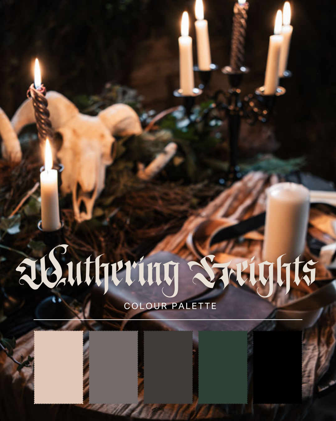
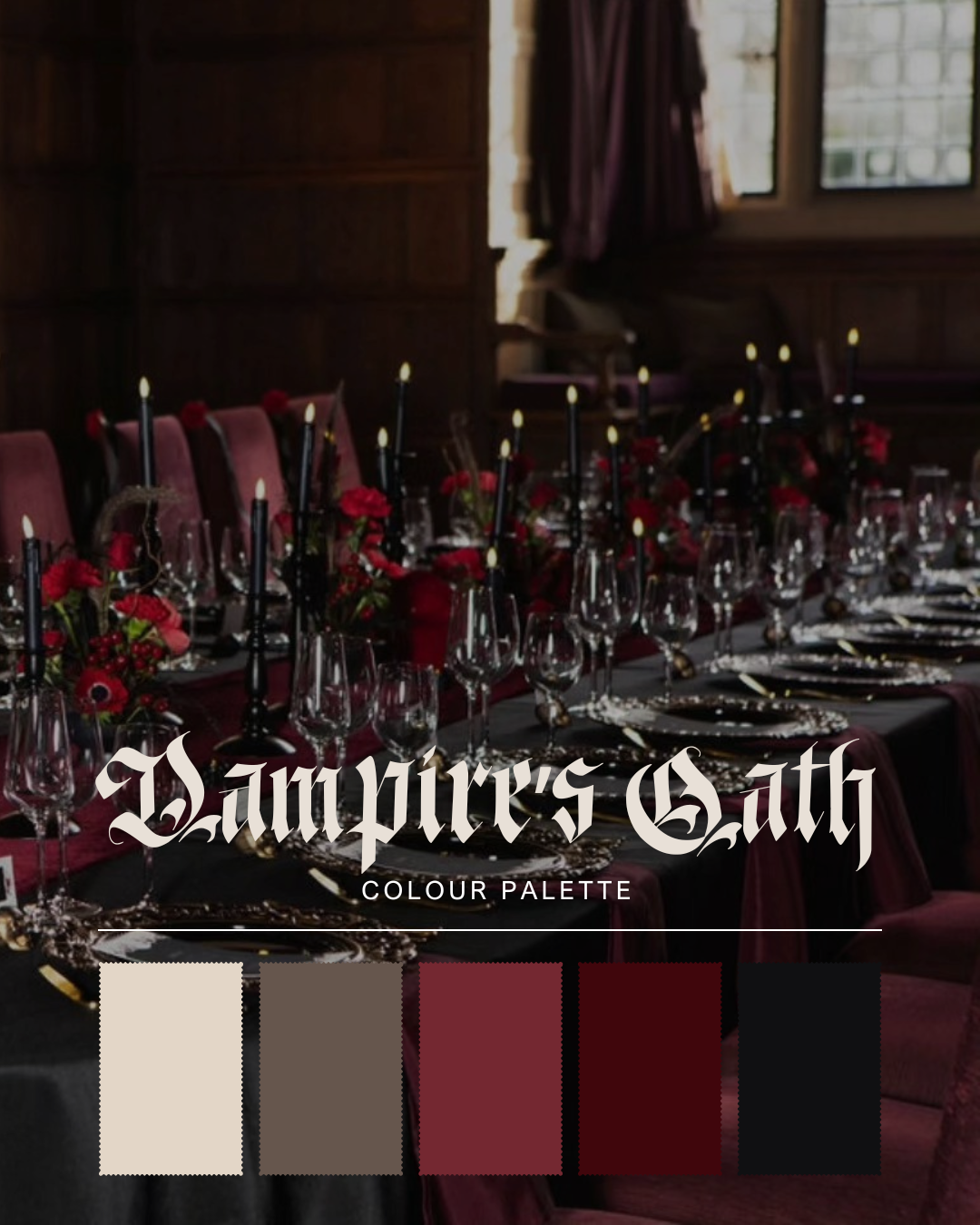
Moody + Romantic: Think gothic opulence. Deep burgundy, oxblood, forest green, midnight blue, dark plum, blackened gold. Add contrast with matte textures and candlelit warmth.
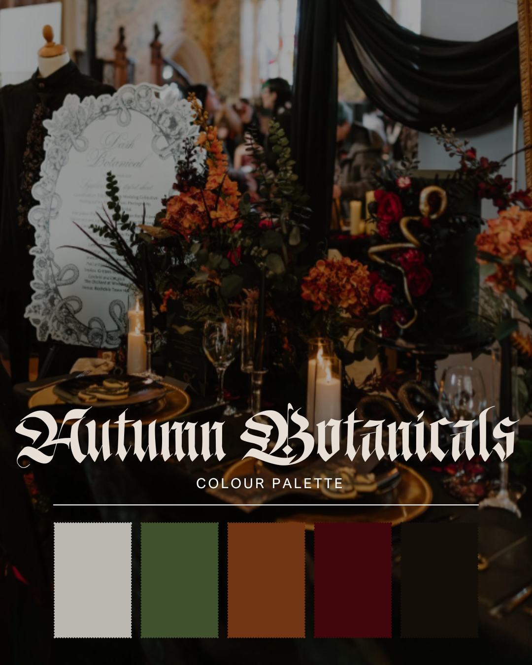
Witchy + Wild: Draw from nature’s eerie side. Charcoal, moss, rust, lichen green, bone white, bronze, and stormcloud grey. Think windswept forests, old stone altars, and moon rituals.
Bright but Offbeat: This isn’t rainbow brights — it’s curated boldness. Mustard, saffron, indigo, maroon, ochre, burnt orange, petrol blue. Think vintage circus meets Wes Anderson.
Once you have the mood, colours become tools for storytelling, not just decoration.
2. Pick a Palette That Tells a Story
But not just any story… It needs to be your story!
Forget colour wheels and Pinterest trends for a moment. A good starting point is your home. Look around: what colours dominate your walls, art, books, and clothes? These are often the tones that already make you feel grounded, powerful, or joyful! And they’re an easy way to find a palette that’s authentic.
If your wardrobe leans towards all black with flashes of oxblood or forest green, start there. If your decor is all velvet curtains, gold frames, and moody lighting, you’ve already got your base palette.
This isn’t about matching. It’s about mirroring what you already love. Taking the tones and fabrics that already represent you and letting them carry through into your wedding day.
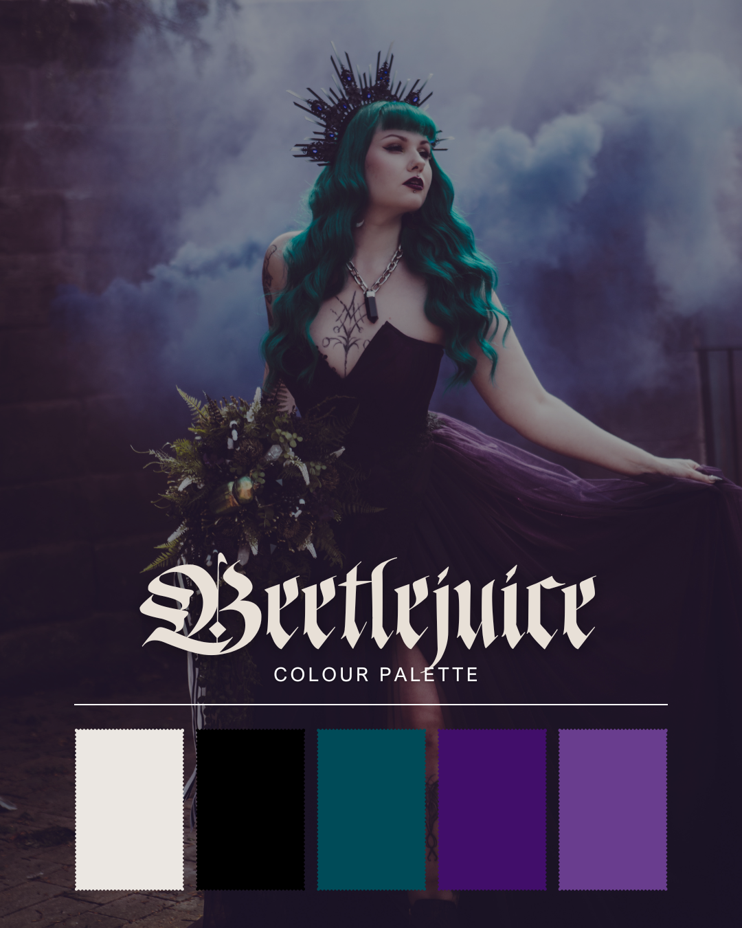
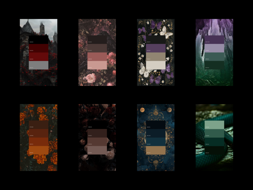
To get the ideas flowing, we’ve pulled together a few of the most striking alternative wedding palettes we are currently in love with all rooted in rich tones, gothic drama, and atmospheric vibes.
3. Test it Against Your Real Life
Once you’ve chosen a palette, see how it interacts with the actual elements of your day:
Venue: Will your colours stand out or clash with the space?
Clothing: Do the tones work with your outfit(s), makeup or accessories?
Florals + Decor: Can you find blooms or fabrics that fit these shades without everything looking too matchy matchy?
Textures: Think velvet, silk, wood, metal, dried botanicals. Use materials to enhance your palette.
Create a physical or digital moodboard with swatches, Pinterest pins, or photos from your own home. If it doesn’t vibe together when viewed side-by-side, tweak it.
4. Stay Grounded in What Feels Like You
There’s no rule that says you need five coordinated shades and a Pantone swatch. You need something that feels honest.
Here’s how to stay grounded:
Don’t colour match everything. Too much coordination can make things feel flat. Choose one or two hero colours and let the rest flow naturally.
Trust your instincts. If you keep returning to black lace, dusky purples, or antique gold, there’s a reason.
Mood > Matching. It’s more important that your colours evoke a vibe than that they look good in a flat lay.
Use your senses. What colours make you feel held? Empowered? Calm? Energised? Your emotional connection is your strongest design tool.
A palette isn’t about getting it right. It’s about getting it true. If your colours feel like a reflection of who you are — messy, beautiful, bold, soft, whatever that means for you — then you’ve nailed it.
5. Let It Be a Guide; Not a Rulebook
Your colours are more than a design choice, they’re an extension of your story. You chose them because they feel like you. Like the people you love. Like the version of the world you’re stepping into together.
So let them guide you. Not with pressure, perfection or rules, but with feeling.
Let them show up in small, beautiful ways. In what you wear, what you hold, how your space feels. Let them shape your day without trying to make your whole day “Pinterest worthy.”
If something doesn’t line up exactly, it’s fine. What matters is that it belongs. That it fits into the world you’re creating. We can drown in inspiration and still feel disconnected, but what will always matter more than aesthetics is comfort. Your preferences. Your joy. This day should be something you fall in love with, not just once, but every time you look back on it.
And if your colours shift halfway through? Let them. You’re allowed to change. Your palette can grow with you.
Because in the end, the palette isn’t the point. You are!